

How is the Niagara real estate market these days?
That is a great question with a not-so-simple answer.
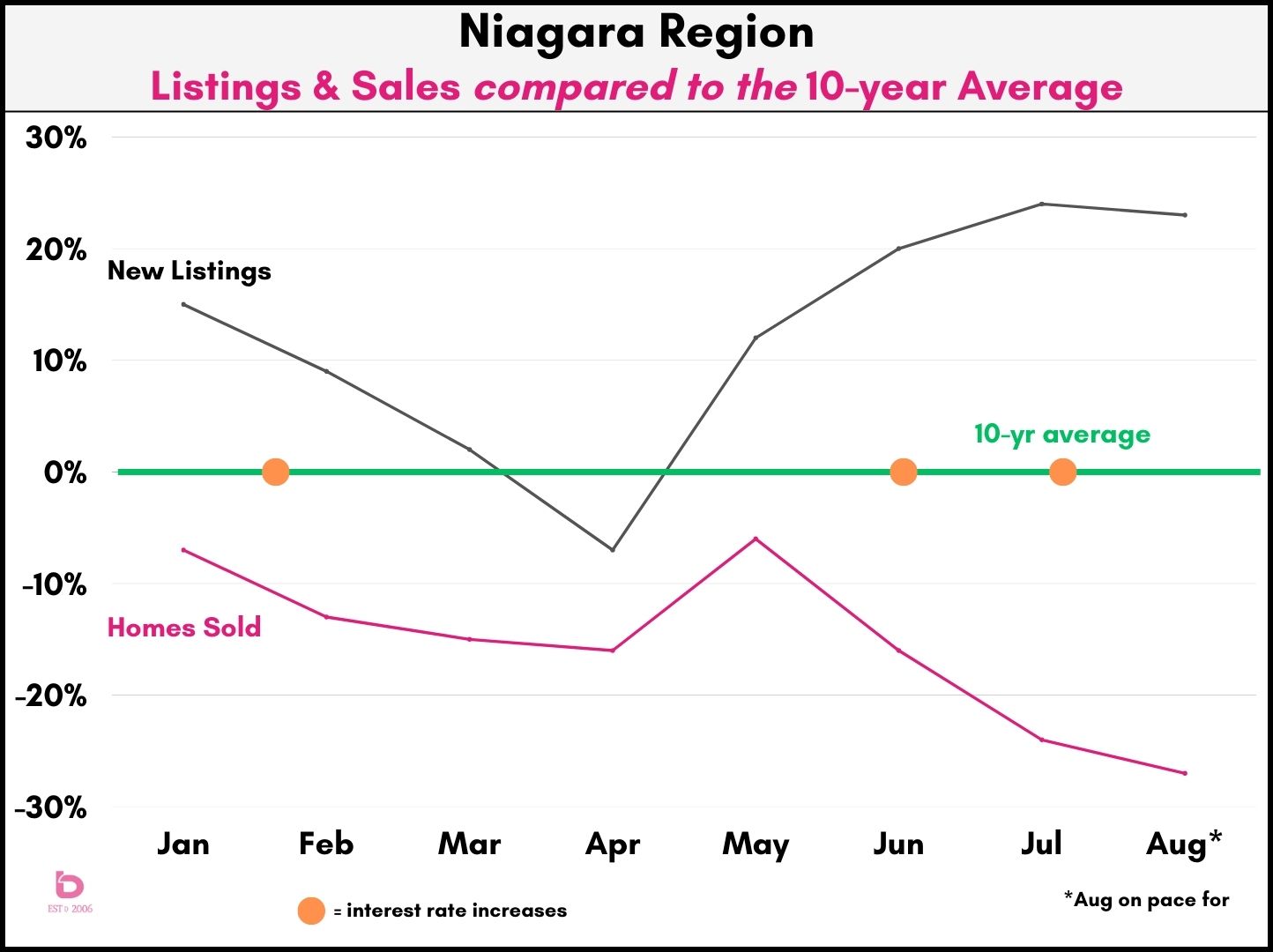
First, as we often do, let's have a quick glance at the balance of supply (# of new listings) and demand (# of sales).
The main thing to know in the first graph is the green line represents the 10-year average for the Niagara real estate market. Or in other words, anything above the green line is above average while anything below the green line is below average.
As well, you'll see 3 orange dots. They represent the 2023 Bank of Canada interest rate hikes.
We would suggest you look at the year in 3 sections:
- Jan - March - new listing inventory was easing back. While sales were still below average (13-15% below the 10-yr average), new listing inventory was also easing back which helped support slow price increases (keep reading for price info)
- April & May - after 4 months of interest rate stabilization, buyer confidence was returning at the same time that new listing inventory continued to recede. The result was average sale prices bumping up $50,000 from February to April.
- Jun - August - you can clearly see the impact that the interest rate hikes had, as new listing inventory started to build while monthly sales pulled back almost instantly. In fact, compared to the 10-yr average, sales were off by 6% in May, 16% in June and 24% in July. We expect that trend will continue through August and into the fall.
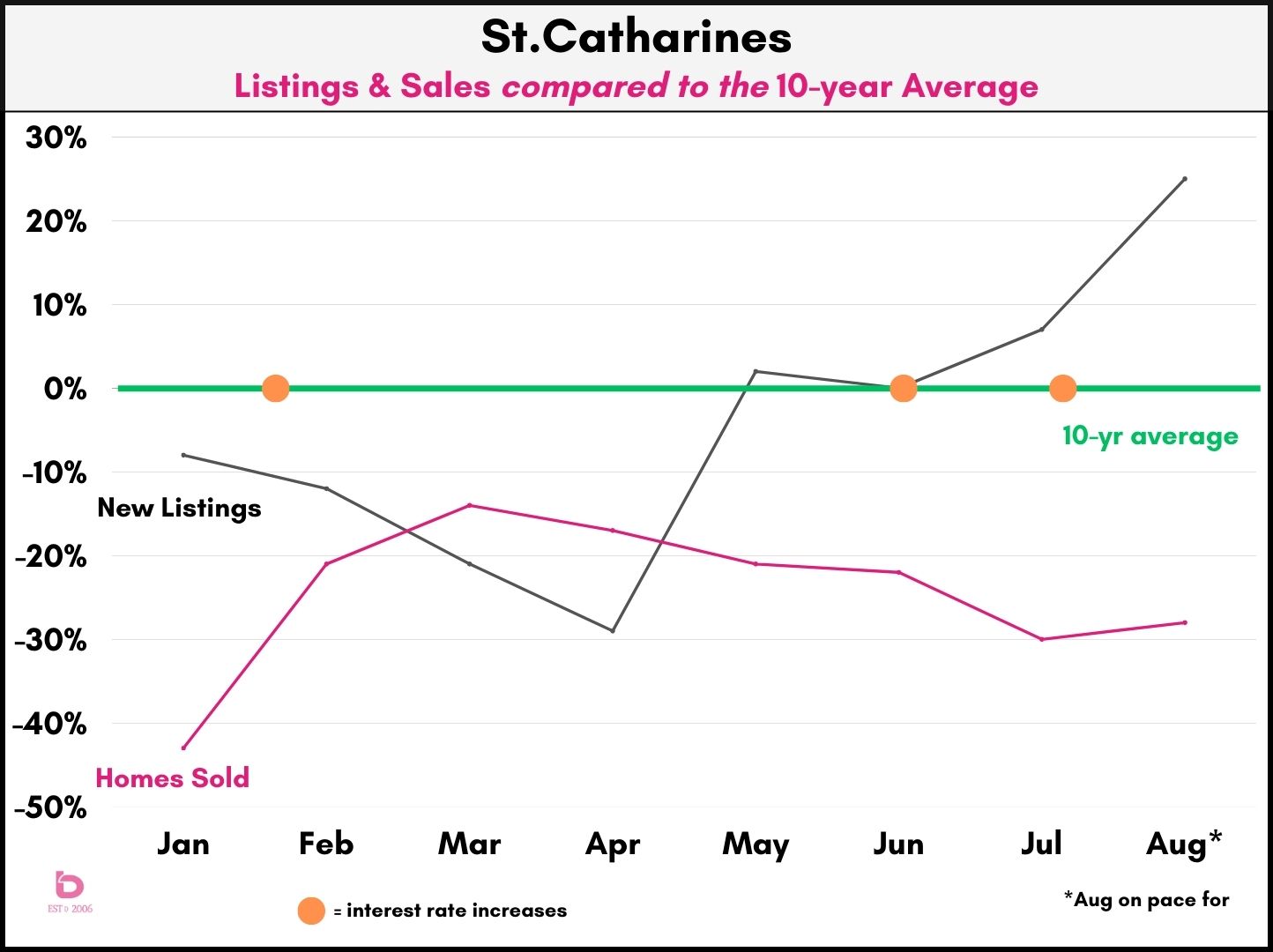
St.Catharines had a similar experience.
Sort of. Note that sales (pink line) outpaced new listing inventory (black line) for both March and April. That market strength had a direct impact on sale prices which bounced around in the $630 - 650,000 range. Very clearly though, the new listing inventory bumped up in August, sitting at 25% above the 10-yr average, which was significantly higher than the previous high which was July at 7% above the average.
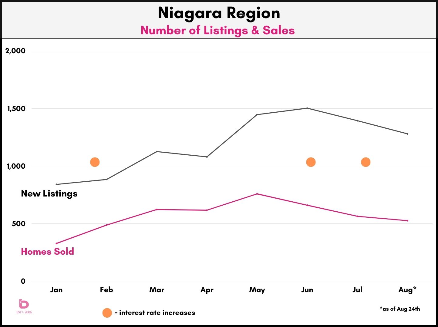
Looking at the simple numbers
Looking at pure numbers, this graph shows the actual number of homes sold (pink line) along with the number of new listings (black line). Again, you can clearly see how sales were impacted after the June & July interest rate hikes. While the next listing activity is declining on a monthly basis, it has still been running 20 - 24% above the 10-yr average for the past 3 months.
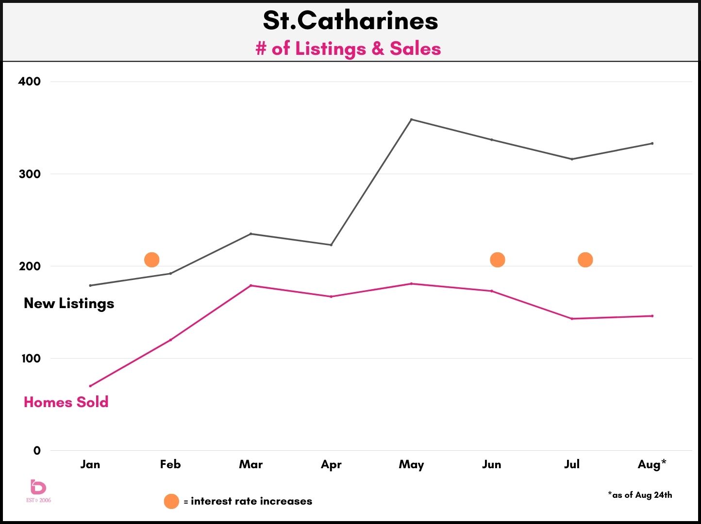
St.Catharines had a similar experience.
One thing that you can clearly see is the jump in new listing inventory from April to May. In particular, the number of new listings jumped from 223 in April to 358 in May. Meanwhile, the monthly number of homes sold has been 'ok' however it has been slowly declining as the impacts of interest rates and buyer confidence has been felt. Similar to the Niagara Region numbers, June - August were similarly underwhelming.
New Listings vs Active Listings
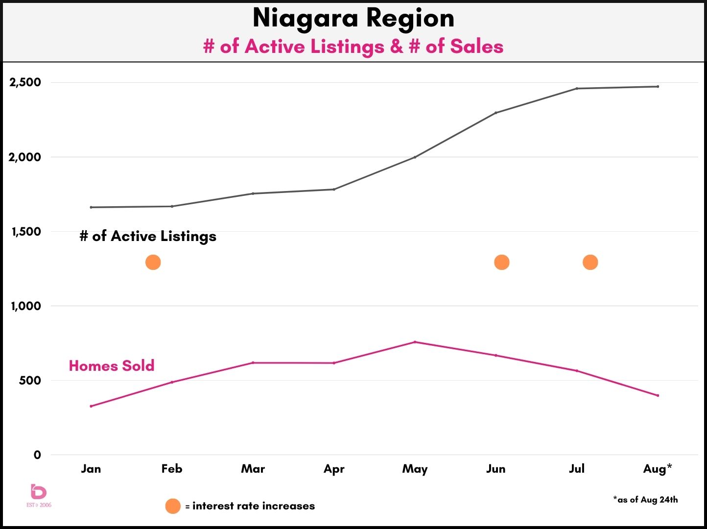
The number of active listings is something we can all feel. When you drive across town, are you seeing For Sale signs everywhere you look? Or is it slim pickins? In the next graph, you can clearly see the growth in active listings through the June - August time period which again, was largely tied into the impact that interest rates had on overall buyer activity. To put it into context, August 2023 pushed up close to 2,500 active listings which would be the highest monthly total in the past 5 years.
What are home prices like?
This is the question that most people ask. What is my home worth? What are Niagara house prices doing these days?
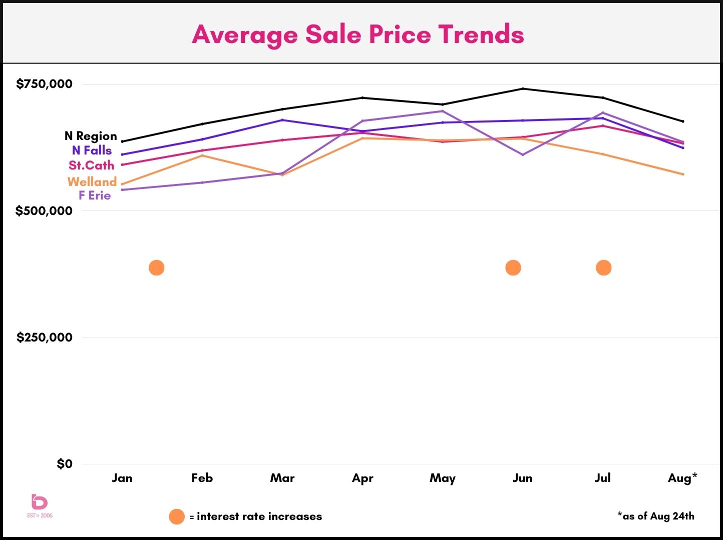
As expected, the sale price trends are a direct result of the dance between supply and demand. So, it should be no surprise that as listings increase and sales pull back, average sale prices also ease back.
In this graph, you'll see average sale prices for the Niagara Region, Niagara Falls, St.Catharines, Welland and Fort Erie. If you're wondering why Niagara-on-the-Lake or Thorold is not included, it is simply because the smaller markets month-to-month data is all over the map. One high priced sale can pull the average up one month and then it'll drop in the opposite direction the next. So, this graph is just for the larger markets of the Niagara Region.
You'll see the slow and steady increases in home prices through the early months of the year which were followed by a pull back in July and August, which followed the interest rate hikes of June and July.
What happens next? We will continue to watch the demand side of the equation. Will interest rates remain where they are in September? It is clear that another increase will only further dampen the demand side of the equation. As a result, the number of new listings will grow which will put further downward pressure on price.
Be sure to check back here as we continue to keep you update with the Niagara real estate market.
Have questions about your home? Please feel free to reach out anytime.