

Date Posted: 03/10/2022
As usual, it all comes down to supply and demand...
How many widgets are for sale and how many people want to buy them. That, in a nutshell, is any market.
So, in the case of Niagara real estate, how many homes are (or have been) for sale combined with how many of them have sold has created what can only be described as a whiplashian sale price trend.
First, a quick explanation of the graphs below:
The horizontal green line: represents the 10-year average. Meaning, anything above that line was higher than average while anything below it was below average.
The grey line: the % difference for the number of sales between each month and the 10-yr average for that month. For example, there were 908 sales in March 2022. The 10-yr average was 700 so March 2022 was 30% higher than the 10-yr average.
The pink line: same as the grey line but for the number of new listings per month.
Let’s get started…
Niagara Region
January: listings well below average and sales well above set the table for an outrageous February & March. This trend carried across all of Niagara.
Notice the quick retreat in the number of sales (black line) from March to June. Sales demand dropped off the table while new listings (pink line) were still running 25 to 40% above normal.
The result? Prices retreated.
July 2022 appears to be the ‘bottom’ for weak sales demand as August and September at least made an effort.
Still though, the number of new listings continues to run 15 – 20% higher than average.
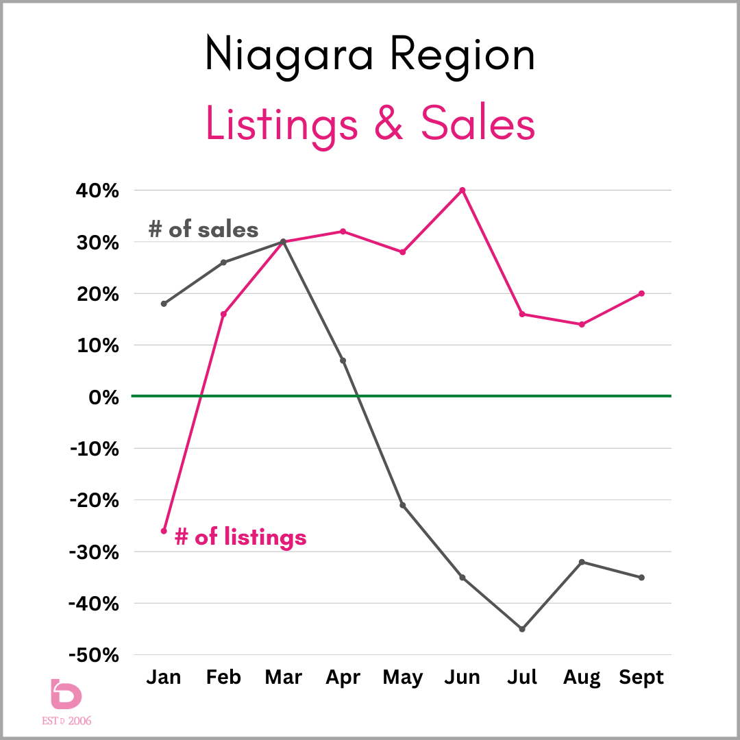
Again. How many widgets are for sale and how many want to buy them. That will determine average sale prices.
You’ll see the obvious drop in average sale prices from May to June. In fact, average sale prices dropped 12% in one single month. That’s a big deal.
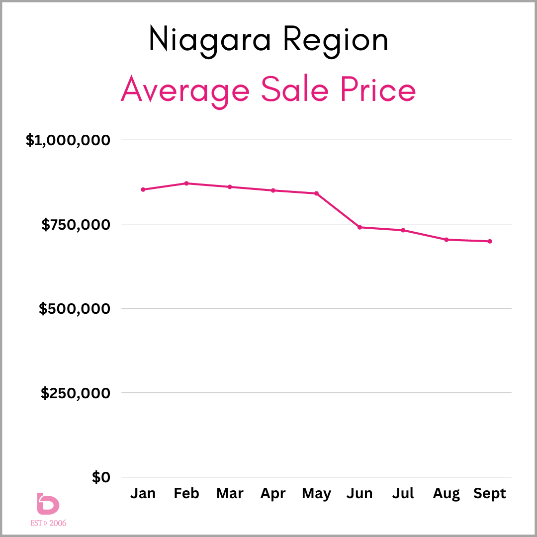
For an explanation, scroll back up to the first graph.
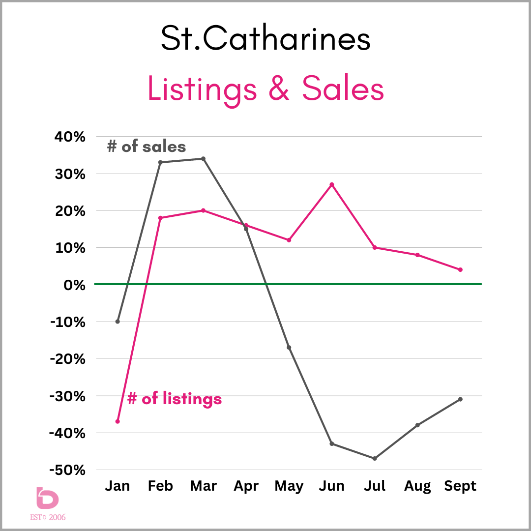
St.Catharines
In any given year, the largest number of homes sell in St.Catharines, so it’s a market to pay attention to, even if you live in Fonthill or Fort Erie.
Again, a massive market in February and March, following by a sales demand retreat into the summer.
Note: sales 40 – 50% below average in June & July while new listings were 12 – 28% above normal.
Too many widgets & not enough people interested in buying them.
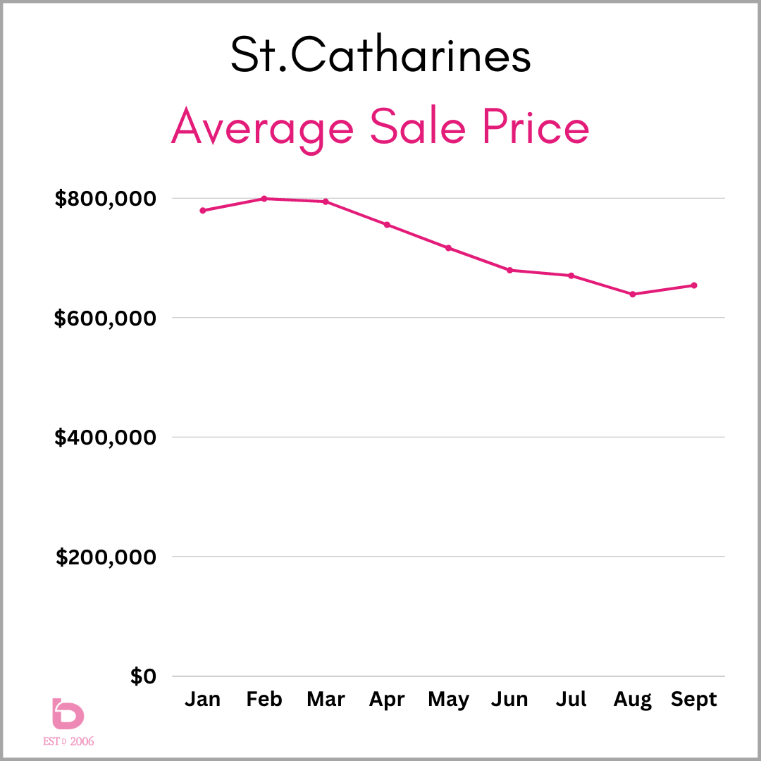
The result? A steady retreat in average sale prices.
However, take a look at the trends in August & September in the Listings & Sales graph just above.
Demand trended up (improved) while the number of new listings trended down (towards normal). The result? Sale price stabilization. The average sale price actually improved from August to September. ...let's consider that a current day victory.
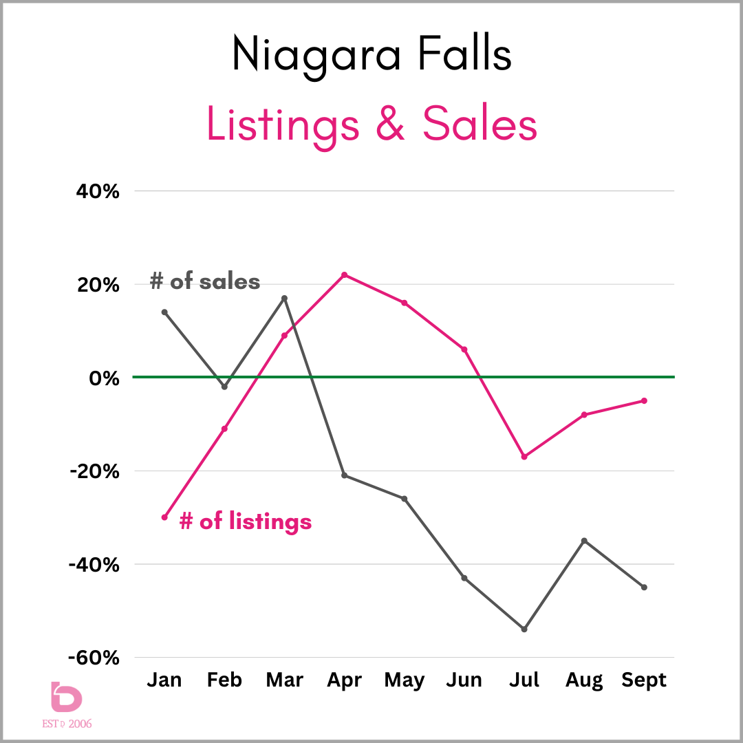
Niagara Falls
Long known for its volatility, the same general trends still apply, just in different amounts.
Have a look at July through September. While new listings were below average (hurray!), the demand was that much more below, running 35 – 55% below average.
In the last few months, listings are trending towards average however, while the number of sales is still wholly disappointing.
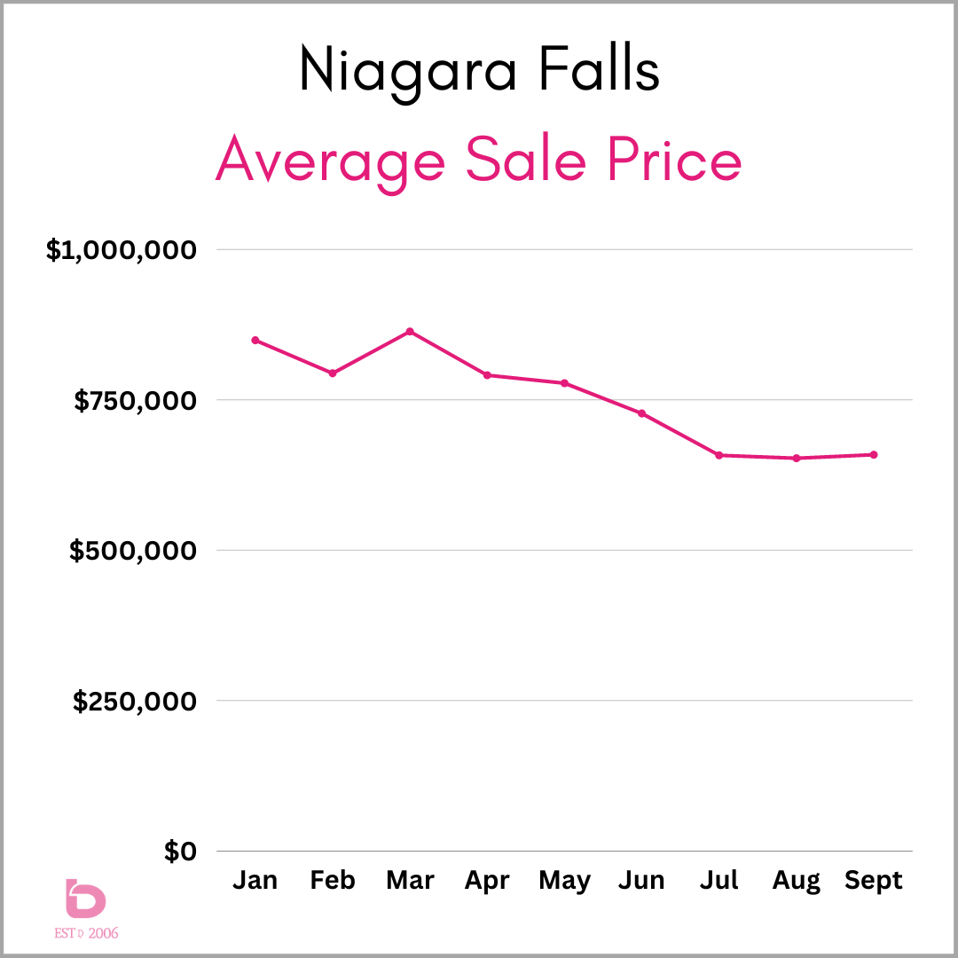
So, while the market has been somewhat dormant, the average sale price has flattened out over the last 3 months, hovering in the $650’s for the last 90 days. While 90 days of relative calm is a welcome change, it is still roughly $200,000 off the peak back in February & March.
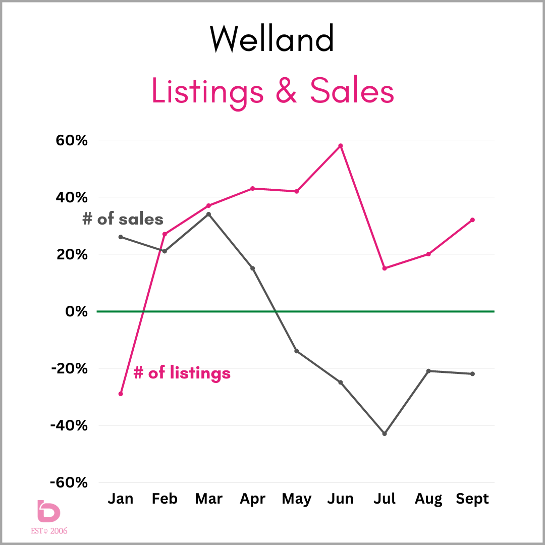
Welland
Wow. Quite the summer in the Rose City.
The number of new listings ran at an outrageous pace, sitting 40 – 60% above average for April through June while the number of sales ran in the other direction.
Even after a return towards normal in July, new listings have trended upwards again through September. Meanwhile, sales have sat at a very underwhelming 20 – 40% below average.
Long story medium. Welland's market has been very imbalanced.
Based on the above, it doesn’t take a scientist of rockets to know what happened with pricing. If you’re a skier, think about a green circle. Not steep, but a steady decline nonetheless.
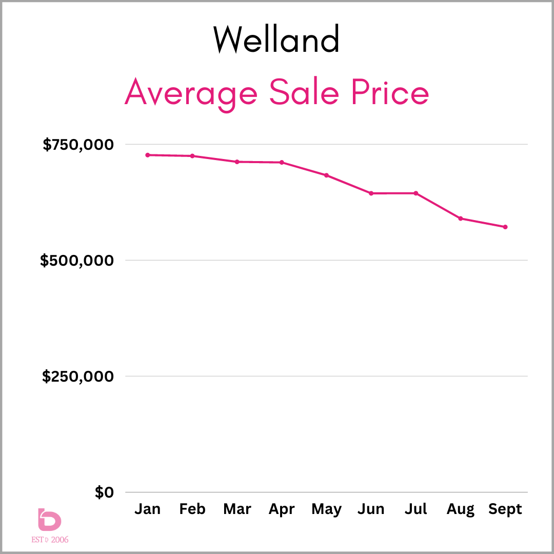
As mentioned in the first sentence above for Welland, note how the average sale price trend reacted, dropping $30 – 40,000 per month for April to June. The sale price trends can all be directly linked to that shifting supply & demand.
After a flattening in June & July (they were almost identical at $644,000), August and September fell flat again, dropping another $70,000 combined.
But what about the rest of Niagara!?
Volume of sales are critical. If a city only has 12 or 16 sales in a particular month, the graphs will more resemble an EKG printout than a relevant graph for real estate trends.
Look no further than the average sales price trend for Fonthill. With only 15 – 20 sales per month, a high or low sale price can pull the average in the wrong direction at any given moment.
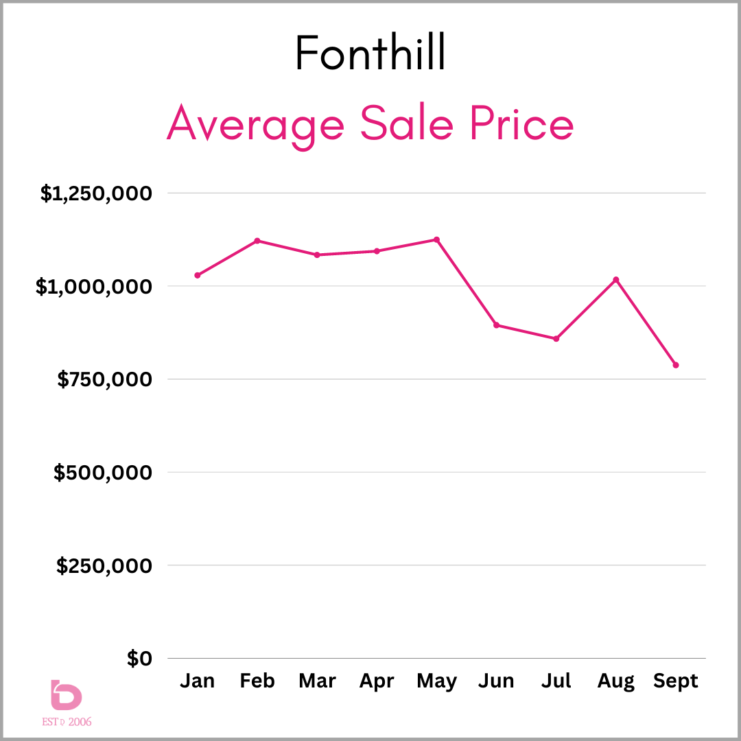
So, for the smaller market cities, you really need to look more specific at the home, the neighbourhood and then do some research from there.
If that is something you’d be interested in for your home, please do not hesitate to reach out. We’re happy to put something together for you.
And that is the real estate market in a nutshell. Very simple and very complicated all at the same time…that’s what makes it fun. (?)
There are a few things we know for sure.
- Markets always change. It is what they do best, so rest assured, this current market stagnation will change. It’s only a matter of time.
- We will keep tracking things and keep you updated as we always do.
- Questions or comments are always welcome.
Thank-you for visiting!