

Woah! What a market!
Comparing April 2021 v April 2020 is like comparing your best ever game of golf against your worst ever. And by best and worst, we mean you shot 20 strokes less than normal and 20 strokes higher than normal.
Or like comparing an apple to a volleyball.
Or Andre the Giant to Danny DeVito.
As a result, some of the statistics that you’ll see are hilarious and/or eyebrow raising in how wide apart they are but that can largely be tied to how particularly unique both individual months were. So, let's have a look and provide some context.
These simple graphs show you the bumpy ride that the last 2 Aprils were.
April 2020 was essentially put on ice with new listings and sales both pulling way back. Here in April 2021, the market and general public showed us how quickly they can adapt to another shutdown by deciding to buy and sell homes at record levels.
These graphics show you market data for Niagara Region as well as the 2 largest volume markets, St.Catharines and Niagara Falls:
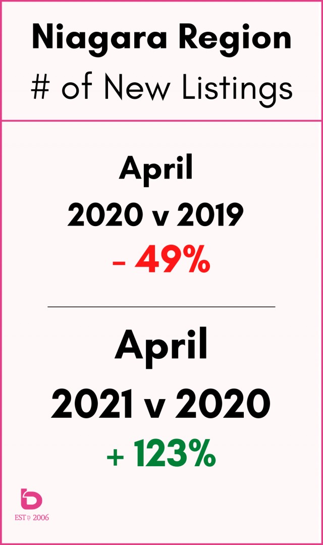
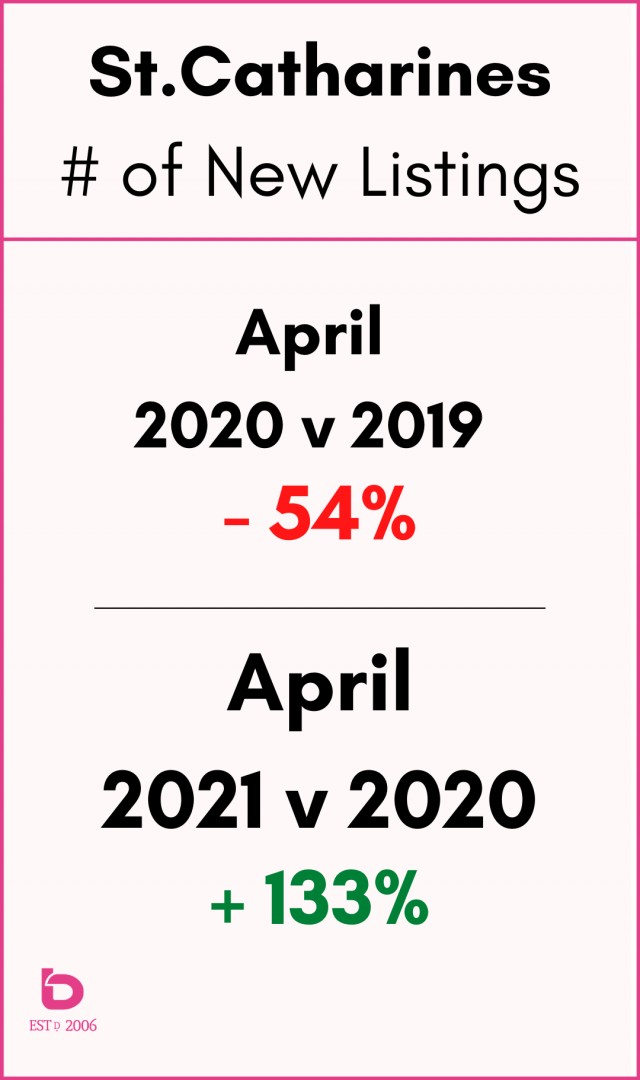
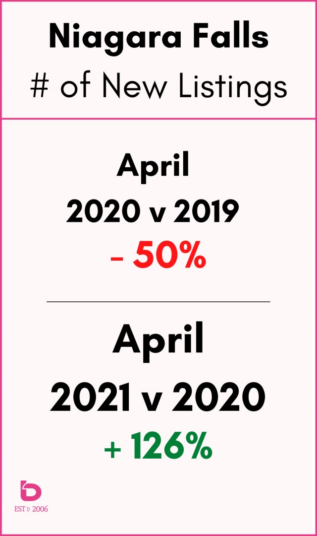
So, yes, April 2021 was very strong...a fact made even stronger due to how weak April 2020 was.
Here is a look at the same concept but for the number of homes sold:
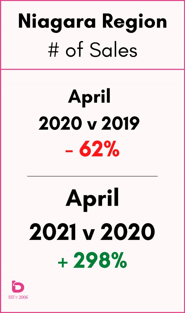
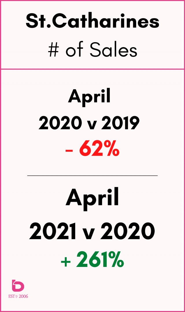
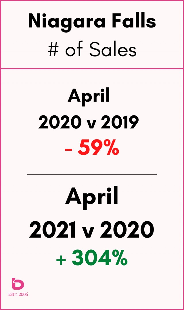
Imagine a month where the number of sales are up 300%!? Or 200%?! Or 50%!!? ...you get the point.
Astonishing numbers really.
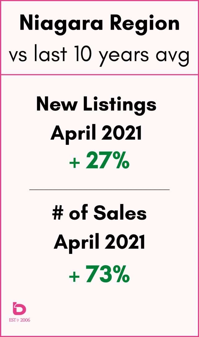
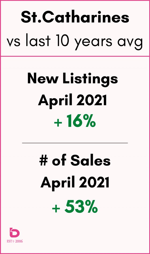
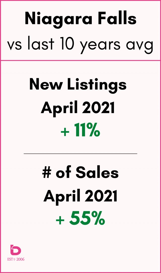
How does April 2021 compare to a "typical"April?
These graphics show you how April 2021 compares to the average over the previous 10 Aprils (back to April 2011).
How do these monthly sales totals compare to any month over the last 5 years?
This graph shows you monthly sales going back to 2017 and puts how huge March and April 2021 were in comparison to recent times.
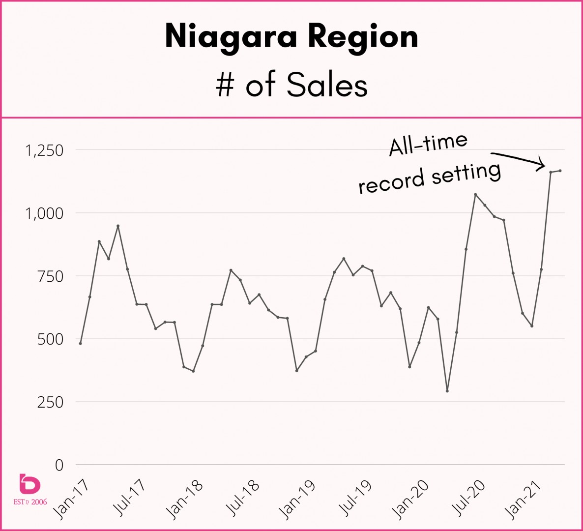
It's hard to comprehend how April 2021, a month of lockdown and relentless COVID fatigue, can set a record for the highest number of sales all-time for Niagara. But that's exactly what just happened.
What about new listings?
Incredibly and contrary to what you may think, the number of new listings just set all-time records as well with March 2021 posting 1st place all-time and April 2021 now holding 2nd place all-time in the number of new listings.
Exhibit A:
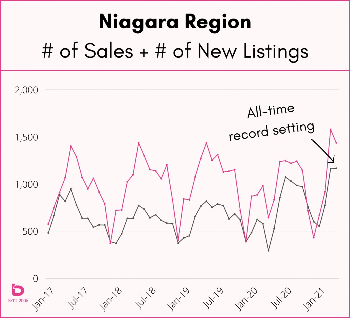
So yes, while the number of new listings have improved, the number of sales continues to outpace that supply. The result?
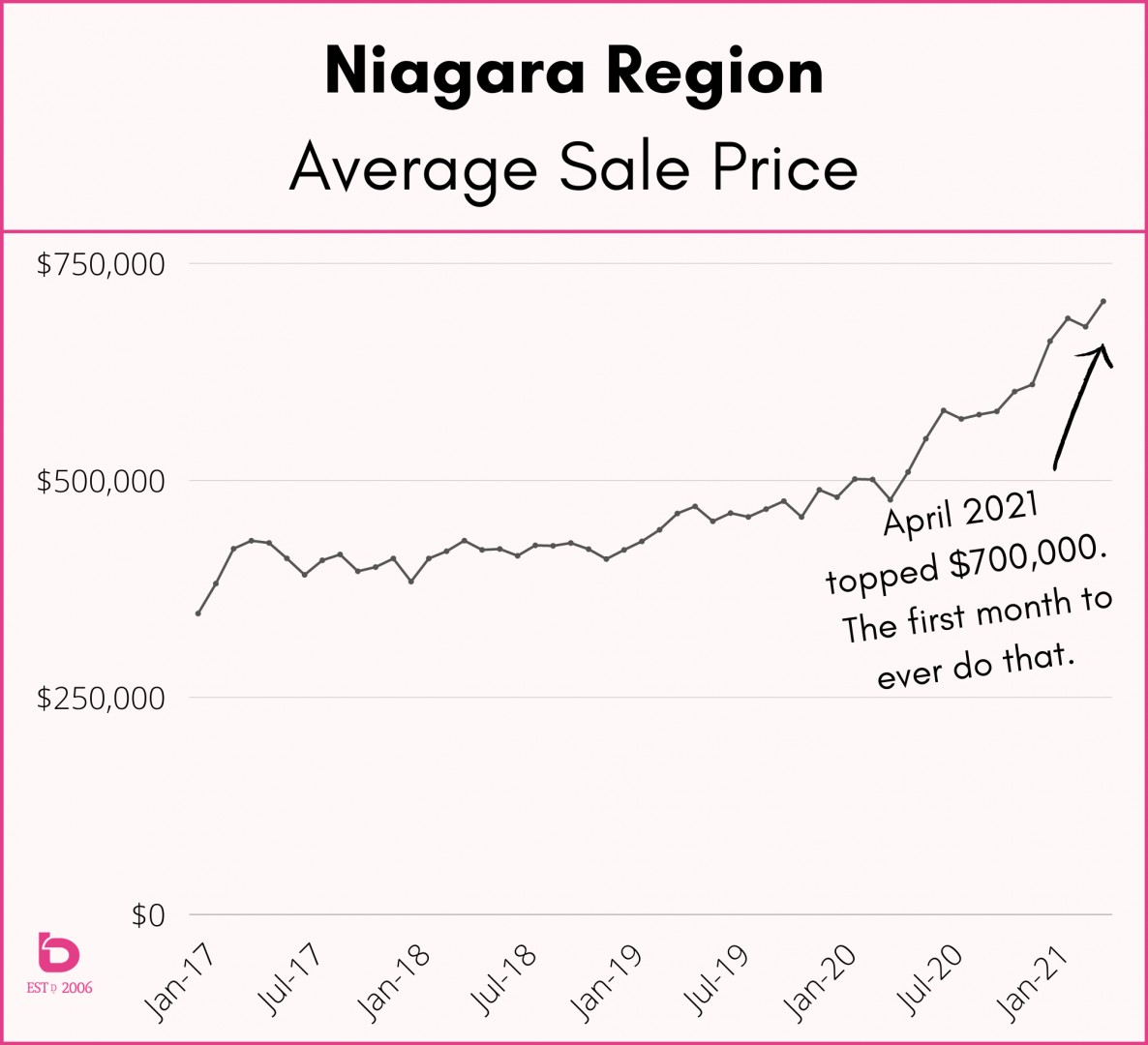
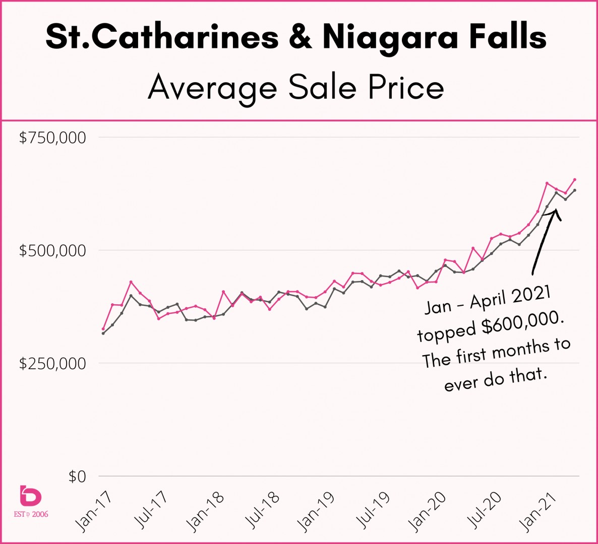
The average sales prices continue to climb...
Here is a look at the Niagara Region:
How about St.Catharines & Niagara Falls? Kind of the same concept, just not as intense. Have a look:
St.Catharines in black. Niagara Falls in pink.
You could argue that price escalation is tied directly to negative to pretty good new listing inventory colliding with massive sales volume (# of homes sold).
That's a quick(ish) look at where real estate in Niagara is currently. That same trend continues in large part across the region whether looking at real estate in Fort Erie, Grimsby, Thorold, Fonthill or Niagara-on-the-Lake.
Questions? Looking to get more specific to your area or neighbourhood?
Feel free to reach out anytime. We're here to help. :)