

Here we are at the end of February 2021 and the Niagara real estate train continues to chug along. The refrain of not enough supply resembles a skipping record at this point.
With that being said, there is some intriguing data to serve up so let’s get started.
Lack of Supply
Regardless of how you chop up the last 3 or 4 months, the market in general has been undersupplied by about 20 - 25%. Meaning, when looking back over the last decade, the number of monthly new listings are underperforming from what could be reasonably expected.
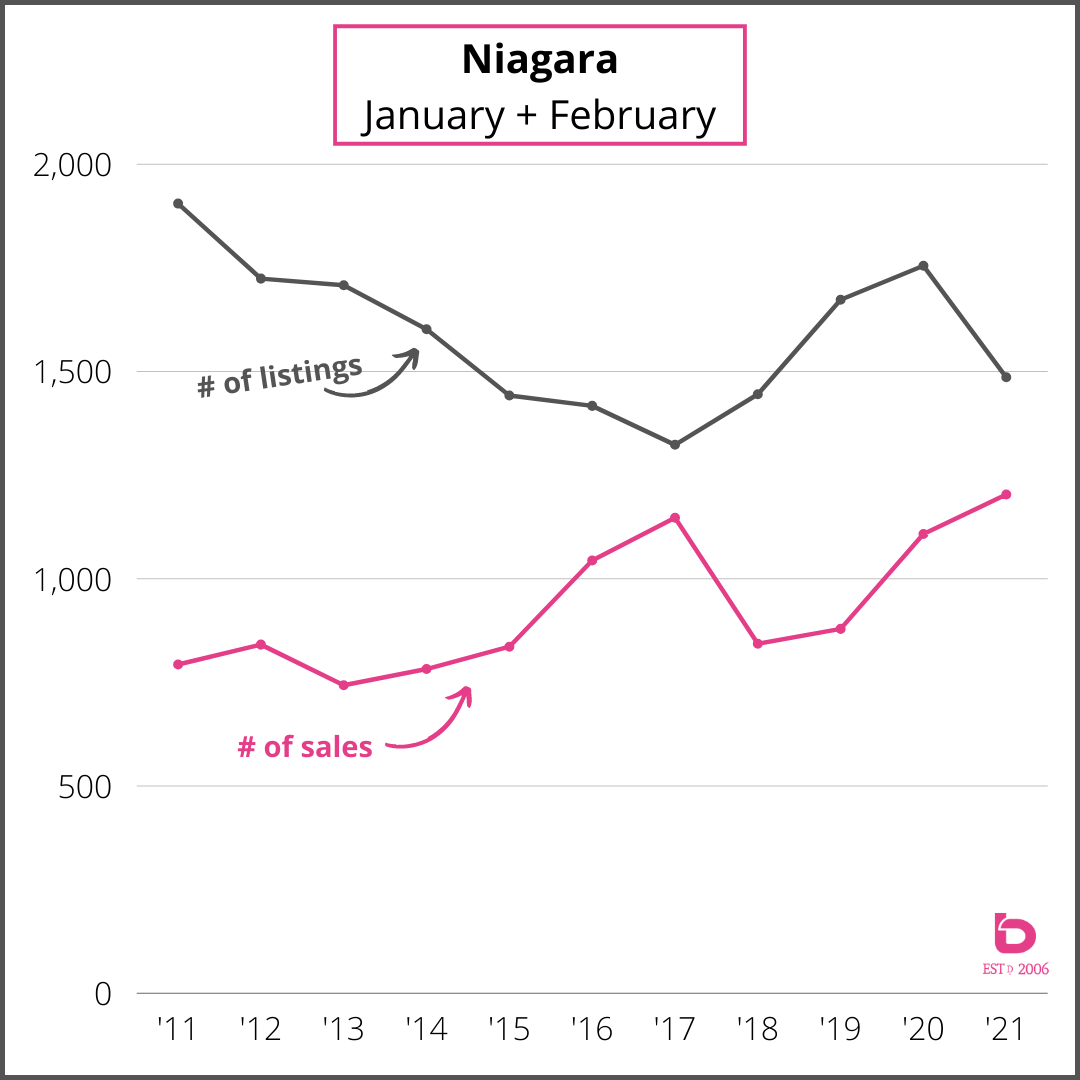
Have a look at these graphs for Niagara. It is looking at January + February combined for the number of new listings and the number of sales.
Note the spread in supply & demand back in 2011-2014 until the clamp down started through 2016 and 2017. After a brief respite in 2018 and 2019, the Niagara real estate market has clamped right back here in 2021.
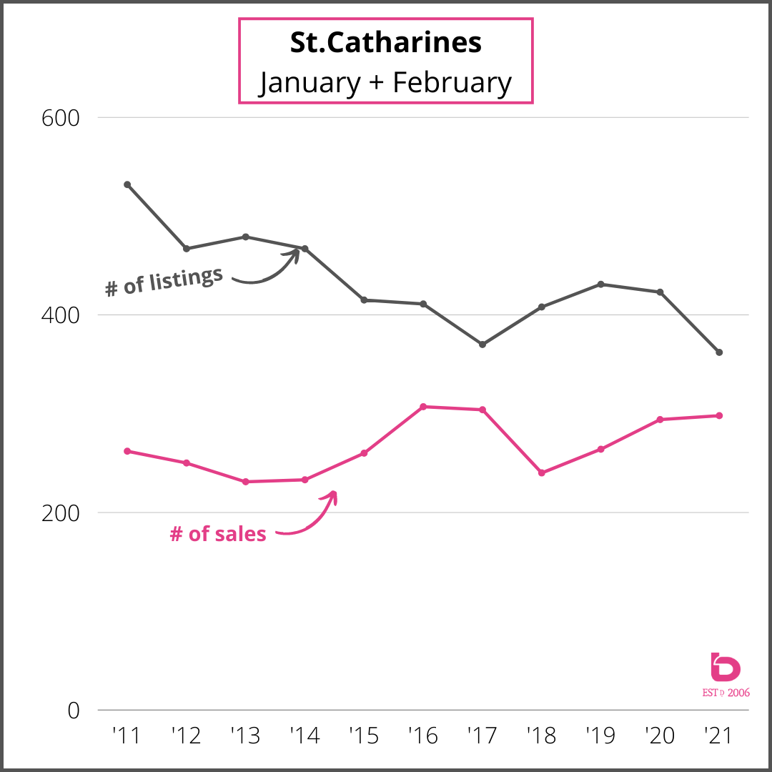
Here is the same graph but for St.Catharines real estate where the clamp down is even more pronounced:
Narrowing the Scope
The online system that we use everyday to search listings and track data has a tool called the “Market Watch”. It’s where we go to see new listings, sold listings etc. When looking at 7 day intervals, it really shows the state of affairs.
Here is what our previous 7 days looked like as of February 26th, 2021:
Niagara:
208 new listings
197 sales
Avg Sale Price $668,000
107% of asking
St.Catharines:
42 new listings
50 sales
Avg Sale Price $639,000
109% of asking
Niagara Falls:
44 new listings
46 sales
Avg Sale Price $579,000
111% of asking
Welland:
24 new listings
29 sales
Avg Sale Price $537,000
108% of asking
So, there you see the 3 largest volume markets in Niagara (St.Catharines, Niagara Falls & Welland) with more sales than new listings. …and that trend of supply and demand imbalance has been ongoing for the last several months which is only feeding our price escalation.
Distribution of Sales
Another trend that will come as no surprise is the distribution of sales across the various price segments.
These graphs look at St.Catharines and the number of sales per price segment for the months January & February going back 3 years. You’ll see the slow shift from 2019 to 2020 which only accelerated here in the first few months of 2021. The green bar shows what was the top segment for that particular year:
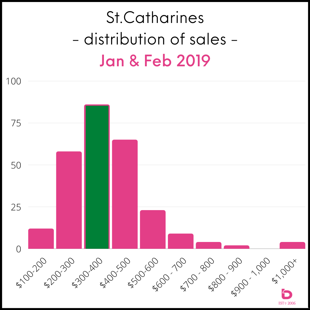
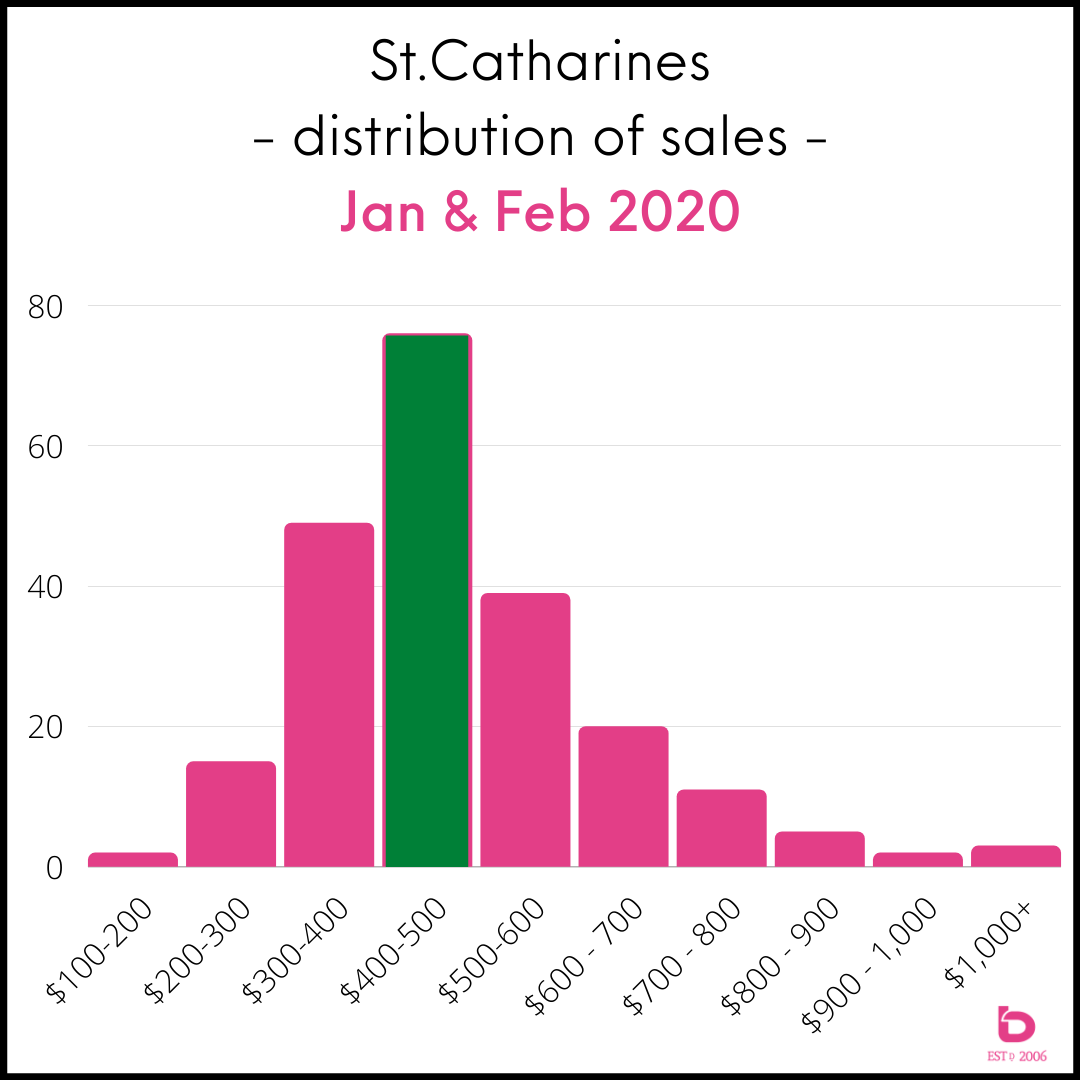
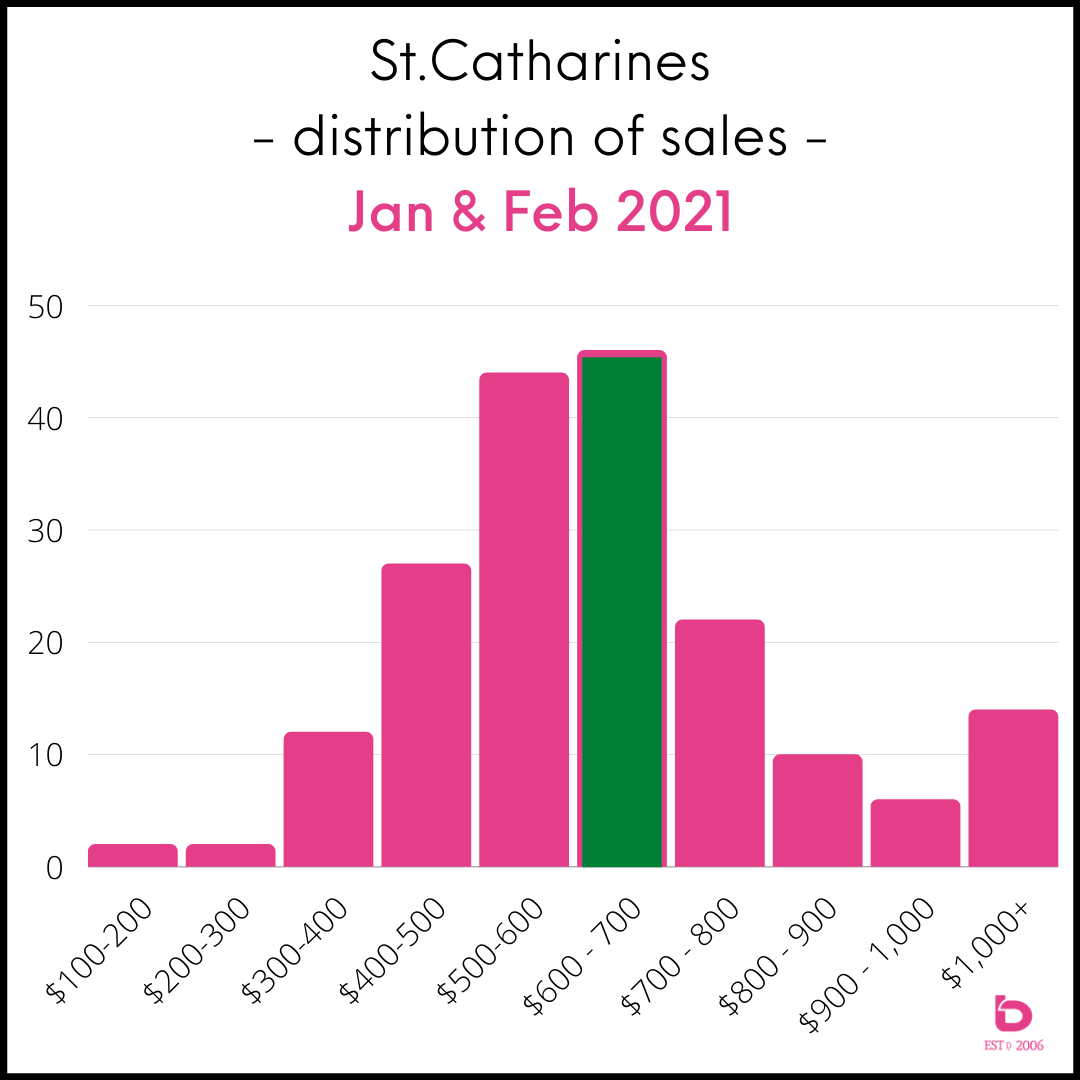
This speaks to the change in affordability as many in the area find themselves priced out of the market. For example, the average sale price of a detached home in St.Catharines north of Scott under $1 million went from:
November 2018 to February 2019: $439,000
November 2019 to February 2020: $501,000
November 2020 to February 2021: $641,000
Sales Over 1 Million
Last piece of the puzzle. The number of homes sold over $1 million has reached astonishing levels.
Exhibit A:
For January + February for 2011 through 2020 combined = 93 sales
January + February 2021 = 108 sales
This graph shows you the last decade for # of homes sold over $1 million for all of Niagara. Note that 2021 YTD (57 days into the year) has had the same number of sales as the 2018 annual total.
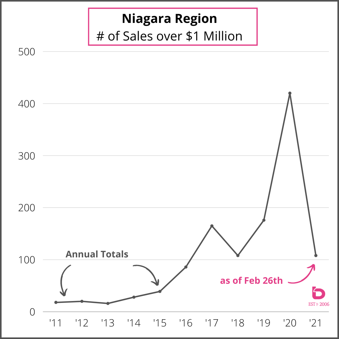
It's clear at this point that the market over $1 million has reach a new cruising altitude. Even if the year carries on at its current rate, 2021 will produce the better part of 700 sales over $1 million, up from 420 in 2020 and 176 sales in 2019.
That should do it for this edition. Any questions or if you’d like us to serve up anything on our next bLOG, let us know and we’ll make it happen!