

Statistical snacks. Bite sized data nuggets.
...and the key ingredient is fresh. These are timely, right out of the oven real estate morsels.
Enough already. Let's get to it.
Slim Pickins...
Currently in all of Niagara, there are 102 detached homes for sale under $600,000.
28 of them have offers in place so that leaves 74 listings.
That is from Grimsby to Beamsville to St.Catharines. Niagara-on-the-Lake to Niagara Falls, Thorold, Welland, Fonthill. Fort Erie, Port Colborne...you get the point.
As popular as toilet paper in April...
In the last 60 days there were 503 detached homes sold under $600,000.
That is 8.3 homes sold per day.
So based on the available inventory, if nothing else was listed, the shelves would be bare in just under 9 days.
Oh, and those 503 listings sold on average for 101.5% of asking price. 503 sales average more than the asking price. This is 2016 Part Deux.
There are currently 138 homes listed for more than $1 million
As mentioned in some of our previous updates, the million dollar plus market is now up and running across Niagara. In fact, there have already been 9 sales over a million so far in 2021 which is nearly 1 per day.
That's fairly impressive given that a decade ago in 2011 there were 20 in total.
How many sales over $1 million were there in 2020? 438. That is 22 x growth in 10 years.
We need more cowbell!
For the purposes of this bLOG, cowbell = new listings.
Cases in point:
In St.Catharines, the monthly new listing inventory was either boringly average and mildly underwhelming. That occured while the monthly number of sales was either historically terrible (April) or excellent (the rest of the year). For example, the last 6 months of 2020 each were the strongest for their respective months going back the last 10 years.
If you recall the 2015 - 2017 markets, you'll realize how truly impressive 2020 was.
Yet more cases in point. This graph shows new listings (in blue) vs # of homes sold (in pink) on a quarterly basis going back a decade.
A few things.
Q4 (Oct - Dec) of 2020 was the first time any quarter on record had more sales than listings. You can see where the pink line at Q4 2020 is at a higher value than the blue line.
All of the low points on the graph below are the 4th Q (Oct - Dec) which is typically a slower time of the year. Note there were 598 sales in Q4 2020. That is about 10% more than 2nd place 2016 Q4.
Meanwhile, note how low the blue line is in 2020. That is the supply line.

Hey. Do you guys remember high school economics!?
The extraordinary markets of 2016 and 2020 produced the largest annual price growth on record. Here is a look at the monthly growth over the last decade:
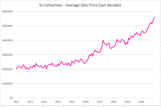
You can clearly see the massive growth in price in both the 2016-2017 market as well as through 2020. It's worth noting that both markets had a few things in common.
Average amounts of new listings (supply) coupled with major levels of demand (high sales volume) which resulted in historic growth in the average sale price growth.
ok. That should just about do it. We don't want to spoil your dinner! :)
Thank-you as always for visiting.
Have a market stat or piece of data that you'd like us to cover? Reach out anytime and we'll be sure to add it to the next volume of Statistical Charcuterie.
Take care.