

A TALE OF FOUR CHARTS.
While some will make a sport out of predicting the future, if there is one thing we’ve learned in recent years, it is that predicting future real estate markets is incredibly dangerous territory.
After all, I’m still waiting to find the person who would have predicted December 2021 to January 2022 would produce the largest one-month gain in average sale price in Niagara history (approximately $100,000), only to be followed up with a near-equivalent drop five months later.
So, rather than predict, we prefer to use past data and trends in an attempt to shed further light on current events and perhaps create scenarios for where we might go next.
With that, here are four charts that shine the brightest of lights on the current state of the Niagara real estate market.
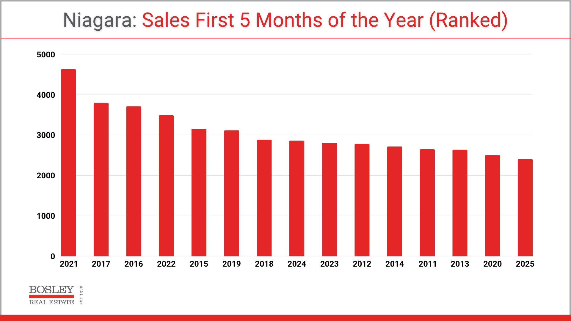
1. SALES. How does 2025 compare?
This first graph ranks the number of annual home sales in Niagara over the last 15 years, ranking them from highest to lowest.
The reigning champ (2021) was a strong year from start to finish, so no surprise that the first five months of that year hold down first place. Second and third place were held down by two other record-setting years, 2017 and 2016, respectively.
What is most striking about this chart is the fact that not only did 2025 come in last place, but it has also had fewer sales in the first five months when compared to COVID-ravaged 2020. For example, April and May 2020 still retain the record-low total for sales for those respective months, so the idea that the first five months of 2025 have produced fewer sales than that year really highlights how challenging 2025 has been so far.
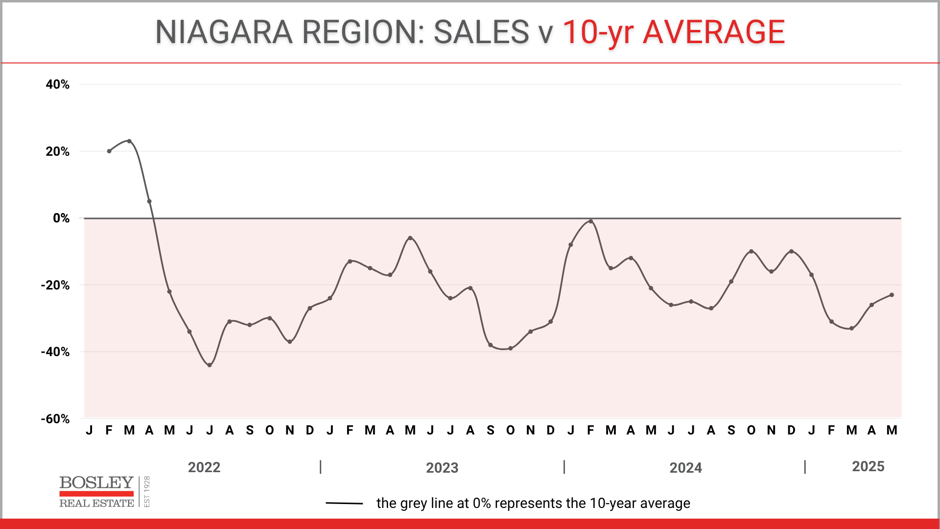
2. SALES. Compared to average.
At a glance, anything in this graph that is in the red, represents sales coming in below the 10-year average. So, with that, you can see that sales have been below the 10-year average for 36 consecutive months.
As a whole, the monthly average has been just over 20% below the 10-year average over that time. We haven’t seen a streak like that in the last 20 years. What is unfortunate is that the end of 2024 was showing improvement across much of the market, with 2025 shaping up to be a more stable year in comparison to the previous three or four.
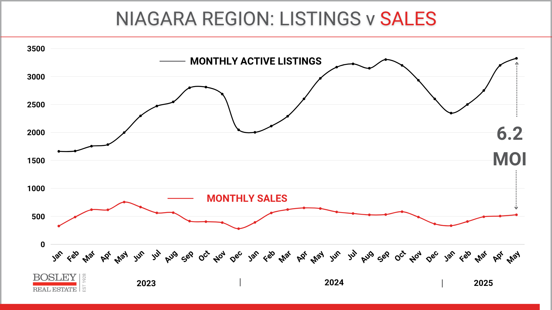
3. SUPPLY & DEMAND.
An age-old classic. How much product is on the shelves, and how many people are coming into the store to buy it. Are the loaves of bread piling up and getting stale, or are the shelves empty with people lined up outside ready to consume the next batch?
In this next chart, the black line represents the supply of active listings on the market, while the red line represents the number of monthly sales. When the two lines get closer, the market is moving faster, prices are generally increasing, and the home selling and buyer process is generally more predictable.
As the gap between the lines widens, there is more unpredictability. Buyers have more choice and may be hesitant to jump. Sellers are more frustrated as For Sale signs get rusty while they (im)patiently wait for the buyers to knock on their door. Pricing faces downward pressure on it and overall, the market is sluggish.
Which brings us to 2025. Note the gap, as we have seen record high available inventory in Niagara, at a time when buyers succumb to the orchestrated uncertainty that our neighbours to the south have brought upon the global climate.
Note: “6.2 MOI” is translated to 6.2 months of inventory. In a nutshell, months of inventory is a quick way to assess the health of a market. 6.2 months of inventory means that if nothing else was listed for sale, based on current demand levels, it would take 6.2 months for all existing inventory to sell. Or in other words, 1 in 6.2 homes per month is selling, while 5.2 out of 6.2 are not. That level of MOI represents a buyer’s market which is characterized by exactly what we’re seeing. More available listings, longer days on the market, lower monthly sales, and downward pressure on sale prices.
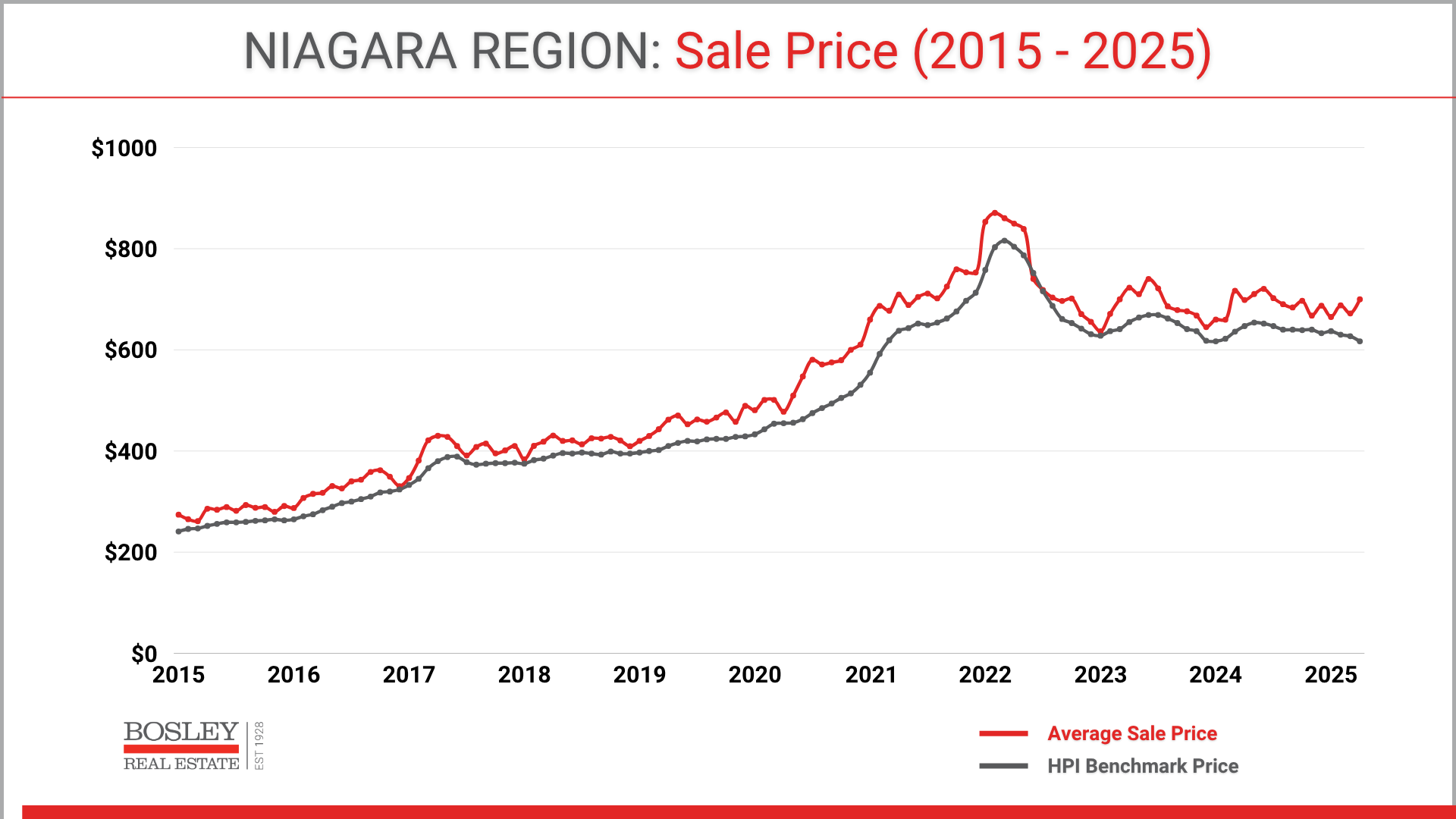
4. SHOW ME THE MONEY
Lastly, and arguably the only chart most people care about, is what is happening to home prices.
“What is my home worth?”
It should come as no surprise at this point that prices are struggling. Going back to the bakery analogy, the baker has only one or two choices to make when her shelves are overflowing with buns and loaves. She needs to shut down the oven for a few days and put a sale tag on the existing product to entice buyers in the door.
In this next chart, you’ll see two lines. The red line is the average sale price, while the grey line is the Benchmark price. The average includes any and all residential sales, thus the volatility, while the Benchmark price represents what is determined to be the most typical home for a particular region.
For Niagara, this is a 3-bed, 2-bath, 1,225 sq. ft. detached bungalow, with a garage and a full basement. You’ll note that the Benchmark price for April 2025 was $617,000, a low point that we haven’t been at since January 2024, and before that, spring of 2021.
What to do with all of this information? There are a few ways to put this info to use.
1. If you're a buyer, recognize that this particular moment in time is presenting market conditions unlike anything we've seen in a large number of years. If jumping into the real estate market is on your agenda, now may be the time to assemble your ducks and get them in a row.
2. If you're a seller, make sure you use this data, but then drill down to how it directly impacts your particular property. What are the current conditions related to supply, demand, and price trends. This is not the type of market to wing it and hope for the best. Optimism is great, but similar to skydiving, it shouldn't be the only approach you bring to the process.
3. Lastly, all markets change, and so too will this one.
Questions? If you'd like to book a call to discuss the market, or real estate in general, please feel comfortable reaching out anytime. We're here and happy to help.